library(here)
library(pmplots)
library(dplyr)
library(patchwork)
library(yspec)1 Introduction
pmplots is an R package to make simple, standardized plots in a pharmacometric data analysis environment. The goal of this package is to create a standard set of commonly used plots in pharmacometric analyses, as opposed to generating a new grammar of graphics.
2 Basic idea
As the most basic functionality, pmplots provides a set of functions that accept a data frame with standardized names and returns a single plot.
Below we load example data from the package to illustrate, using a data set similar to what we typically have after a NONMEM® estimation run.
spec <- ys_load(here("data/derived/pk.yml"))

data <- pmplots::pmplots_data_obs()
head(as.data.frame(data), n = 3)
. C NUM ID SUBJ TIME SEQ CMT EVID AMT DV AGE WT CRCL ALB BMI
. 1 NA 2 1 1 0.61 1 2 0 NA 61.005 28.03 55.16 114.45 4.4 21.67
. 2 NA 3 1 1 1.15 1 2 0 NA 90.976 28.03 55.16 114.45 4.4 21.67
. 3 NA 4 1 1 1.73 1 2 0 NA 122.210 28.03 55.16 114.45 4.4 21.67
. AAG SCR AST ALT HT CP TAFD TAD LDOS MDV BLQ PHASE STUDY RF 102
. 1 106.36 1.14 11.88 12.66 159.55 0 0.61 0.61 5 0 0 1 1 norm 1
. 2 106.36 1.14 11.88 12.66 159.55 0 1.15 1.15 5 0 0 1 1 norm 1
. 3 106.36 1.14 11.88 12.66 159.55 0 1.73 1.73 5 0 0 1 1 norm 1
. IPRED CWRESI NPDE PRED RES WRES CL V2 KA
. 1 69.502 -0.621370 -0.62293 60.886 0.11865 -0.56749 2.5927 40.287 1.452
. 2 91.230 0.089509 0.27064 78.945 12.03100 0.13248 2.5927 40.287 1.452
. 3 97.076 1.598600 1.55480 83.523 38.68700 1.62720 2.5927 40.287 1.452
. ETA1 ETA2 ETA3 DOSE STUDYc CPc CWRES
. 1 -0.0753 -0.18403 -0.095308 5 SAD normal -0.621370
. 2 -0.0753 -0.18403 -0.095308 5 SAD normal 0.089509
. 3 -0.0753 -0.18403 -0.095308 5 SAD normal 1.598600Another data set is based on data in the previous code chunk, but subset to just one record per individual.
id <- pmplots::pmplots_data_id()Some of the “standard” column names include
IDTIMENPDEPREDETA1
We frequently see these names in NONMEM® output and pmplots is set up to take advantage of this.
To create a plot of DV (observed data points) versus PRED (population predictions) we call dv_pred()
dv_pred(data)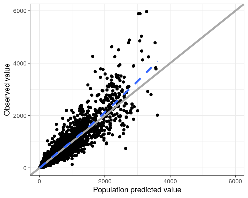
This default plot has the following features
- The x- and y-axes are forced to have the same limits
- There is a reference line at
x = y - There is a loess smooth through the data points
The idea is to create a simple, standardized plot with only minimal code. However, there are ways to customize a plot.
dv_pred(data, yname = "concentration (ng/mL)", smooth = NULL)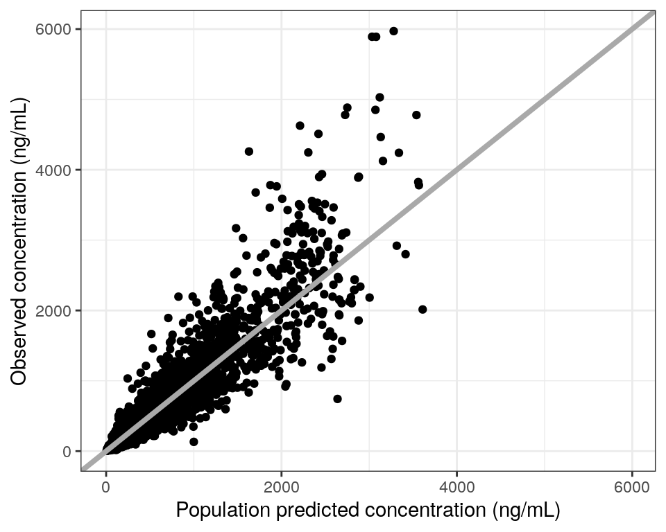
These functions return gg objects so you can continue to customize the plot as you normally would with ggplot2
dv_pred(data) +
  facet_wrap(~STUDYc) +
  ggtitle("DV versus PRED")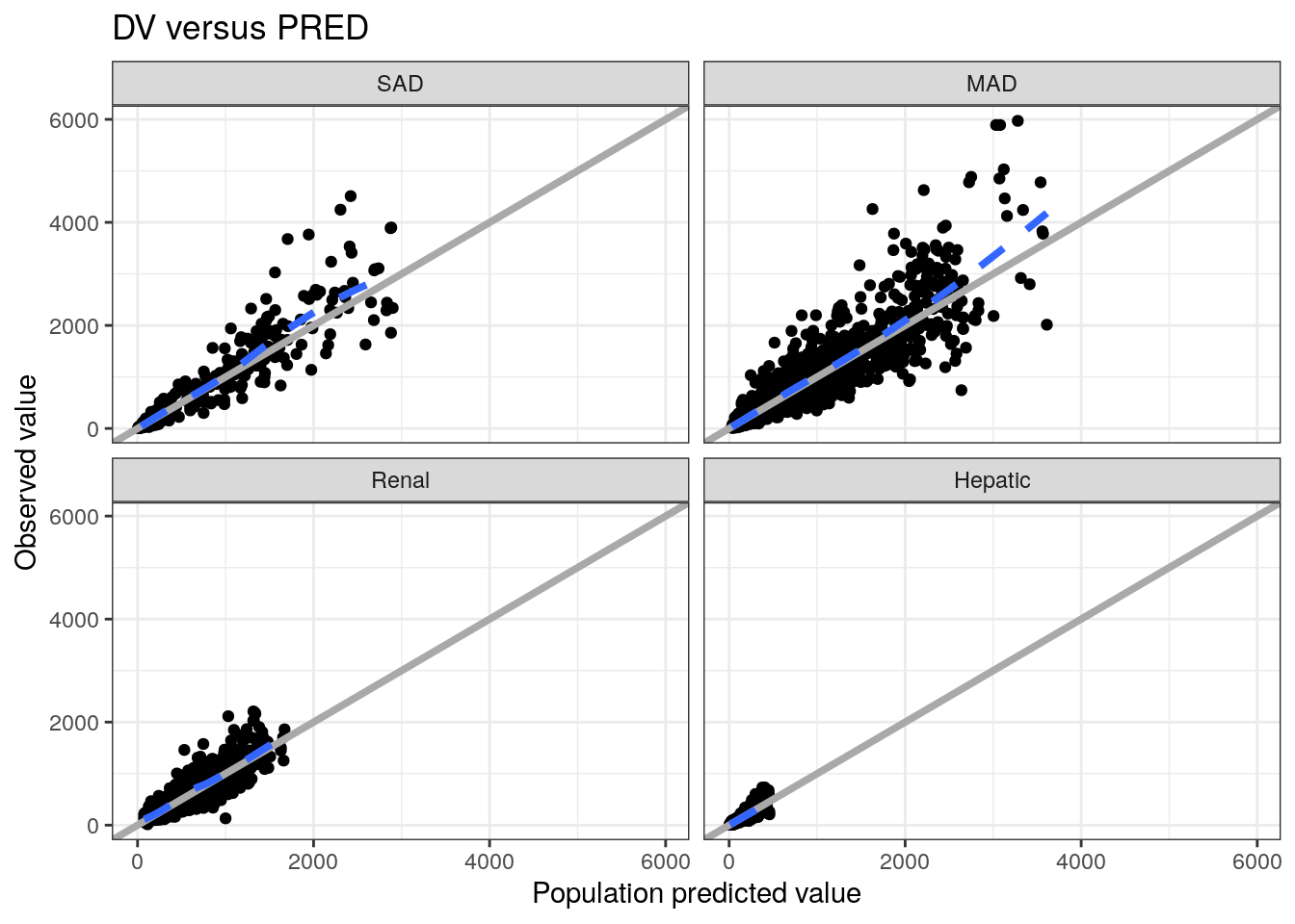
Other plots such as DV, PRED and IPRED include
dv_time()(DVvsTIME)dv_ipred()(DVvsIPRED)dv_preds()(DVvs bothPREDandIPRED)
3 Diagnostic plots
pmplots generates a host of residual diagnostics and similar plots (e.g., NPDE)
Conditional weighted residuals versus time
p1 <- cwres_time(data) Residuals versus population predicted value
p2 <- res_pred(data) NPDE boxplots in each study
p3 <- npde_cat(data, x = "STUDYc//Study") Histogram of weighted residuals
p4 <- wres_hist(data) With output
(p1+p2)/(p3+p4)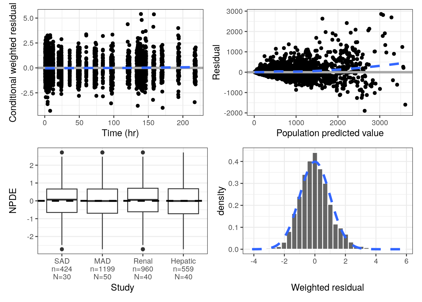
Diagnostic plots can be vectorized, then returned in a list. Pass the list to pm_grid() to arrange them.
eta_cont(id, x = "WT", y = paste0("ETA", c(1,2,3))) %>%
  pm_grid(ncol = 3)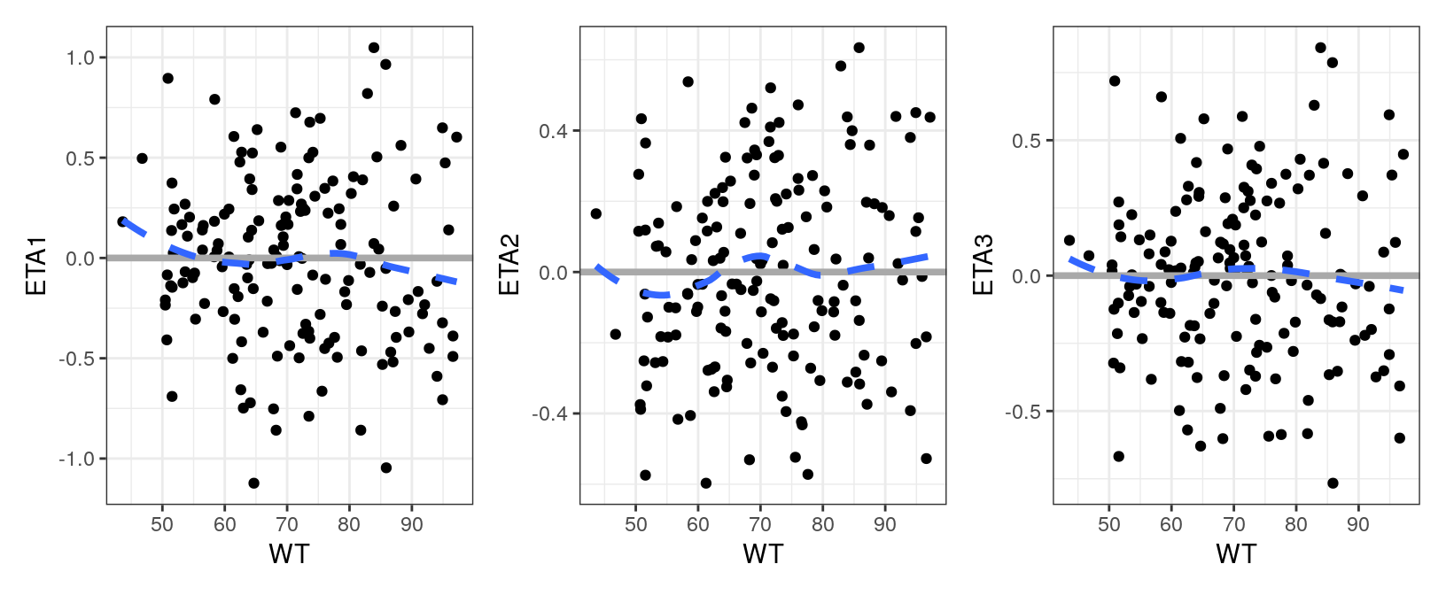
4 Exploratory plots
pmplots also makes plots for exploratory graphics.
We can look at continuous covariates by another categorical covariate.
covar <-
  spec %>%
  ys_select(WT, AGE, BMI, ALB) %>%
  axis_col_labs(title_case = TRUE)

cont_cat(
  id,
  x = "STUDYc//Study ",
  y = covar[1:3],
) %>% pm_grid(ncol = 3)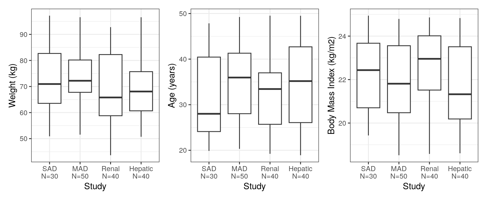
We can also view correlations between continuous covariates.
pairs_plot(data, y = covar)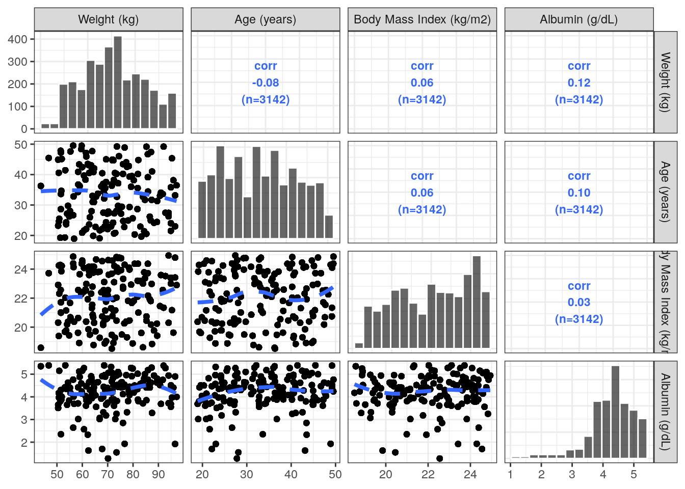
5 col-label
You might have noticed a special syntax that we’ve used in some of the previous plots. For example:
npde_cat(data, x = "STUDYc//Study")Here we are using col-label syntax. This is just a compact way to pass both the name of the column to plot and a more formal axis title. Each col-label is delimited (by default) by //
col_label("STUDYc//Study"). [1] "STUDYc" "Study"After parsing, the left-hand side is column name and the right-hand side is the axis title.
It’s ok to just pass the left-hand side.
col_label("STUDYc"). [1] "STUDYc" "STUDYc"Here the axis title is just the column name.
Axis titles can also contain a subset of TeX syntax that gets parsed by the latex2exp package.
col_label("DV//$\\mu$mol/mL"). [1] "DV" "$\\mu$mol/mL"For example:
dv_time(data, y = "DV//Concentration ($\\mu$mol/mL)")