library(bbr)
library(bbr.bayes)
library(dplyr)
library(here)
library(tidyverse)
library(tidybayes)
library(yspec)
library(tidyvpc)
library(bayesplot)

MODEL_DIR <- here("model", "stan","expo")
FIGURE_DIR <- here("deliv", "figure","expo")

bayesplot::color_scheme_set('viridis')
theme_set(theme_bw())Introduction
This page demonstrates the following steps in a Bayesian workflow:
- Evaluating MCMC convergence diagnostics
- Posterior predictive checks
There is no explicit functionality in bbr.bayes to perform these steps; however, the output from bbr.bayes makes these steps relatively simple.
Tools used
MetrumRG packages
bbr Manage, track, and report modeling activities, through simple R objects, with a user-friendly interface between R and NONMEM®.
CRAN packages
dplyr A grammar of data manipulation.
bayesplot Plotting Bayesian models and diagnostics with ggplot.
tidybayes Integrate Bayesian modeling with the tidyverse.
posterior Provides tools for working with output from Bayesian models, including output from CmdStan.
tidyvpc Create visual predictive checks using tidyverse-style syntax.
Set up
Load required packages and set file paths to your model and figure directories.
MCMC diagnostics
After fitting the model, we examine a suite of MCMC diagnostics to see if there is anything clearly amiss with the sampling. We’ll focus on split R-hat, bulk and tail ESS, trace plots, and density plots. If any of these raise a flag about convergence, then additional diagnostics would be examined.
mod0 <- read_model(file.path(MODEL_DIR, 'mod0'))
fit0 <- read_fit_model(mod0)

fit0$summary(variables=c('tv_e0','tv_ec50','emax','gamma', 'omega_e0','omega_log_ec50')) %>%
  mutate(across(-variable, pmtables::sig))
. # A tibble: 6 × 10
. variable mean median sd mad q5 q95 rhat ess_bulk ess_tail
. <chr> <chr> <chr> <chr> <chr> <chr> <chr> <chr> <chr> <chr>
. 1 tv_e0 -0.269 -0.251 0.951 0.942 -1.88 1.25 1.00 4.05e+03 3.17e+03
. 2 tv_ec50 97.3 97.4 4.37 4.42 90.1 104 1.00 2.87e+03 2.84e+03
. 3 emax 98.6 98.8 1.07 1.11 96.6 99.9 1.00 2.98e+03 2.36e+03
. 4 gamma 0.984 0.982 0.0324 0.0322 0.934 1.04 1.00 3.17e+03 2.81e+03
. 5 omega_e0 1.04 0.921 0.753 0.774 0.07… 2.47 1.00 1.09e+03 1.43e+03
. 6 omega_log_ec50 0.206 0.204 0.0286 0.0277 0.162 0.256 1.00 1.81e+03 3.05e+03For the population-level parameters, the R-hat values are all below 1.01 and ESS bulk and tail values are relatively large. Similarly, all of the individual-level parameters have low R-hat values:
fit0$summary(variables=c('e0','ec50')) %>%
  mutate(across(-variable, pmtables::sig)) %>%
  arrange(desc(rhat)) %>%
  print(n=10)
. # A tibble: 144 × 10
. variable mean median sd mad q5 q95 rhat ess_bulk ess_tail
. <chr> <chr> <chr> <chr> <chr> <chr> <chr> <chr> <chr> <chr>
. 1 ec50[24] 98.6 97.9 11.9 11.4 80.2 120 1.01 6.10e+03 2.86e+03
. 2 e0[1] -0.115 -0.145 1.43 1.30 -2.41 2.25 1.00 4.88e+03 3.17e+03
. 3 e0[2] 0.0630 0.0253 1.40 1.30 -2.09 2.47 1.00 4.31e+03 3.50e+03
. 4 e0[3] 0.107 0.0369 1.50 1.32 -2.21 2.58 1.00 4.36e+03 2.99e+03
. 5 e0[4] -0.0797 -0.0834 1.41 1.27 -2.33 2.26 1.00 5.10e+03 3.30e+03
. 6 e0[5] -0.234 -0.218 1.41 1.29 -2.52 2.00 1.00 4.65e+03 3.02e+03
. 7 e0[6] -0.137 -0.120 1.42 1.27 -2.41 2.24 1.00 5.08e+03 2.96e+03
. 8 e0[7] -0.269 -0.253 1.37 1.27 -2.53 1.90 1.00 5.10e+03 2.79e+03
. 9 e0[8] -0.112 -0.124 1.37 1.25 -2.34 2.11 1.00 4.75e+03 3.19e+03
. 10 e0[9] -0.0522 -0.101 1.50 1.34 -2.34 2.42 1.00 4.86e+03 3.01e+03
. # ℹ 134 more rowsNext, we’ll look at the trace and density plots. Based on the R-hat values, we wouldn’t expect these plots to show any problems with the MCMC sampling.
trace0 <- bayesplot::mcmc_trace(fit0$draws(),
                                pars=c('tv_e0','tv_ec50','emax','gamma',
                                       'omega_e0','omega_log_ec50'))
trace0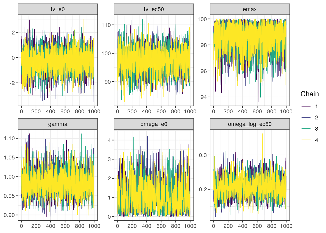
density0 <- mcmc_dens_overlay(fit0$draws(),
                      pars=c('tv_e0','tv_ec50','emax','gamma',
                             'omega_e0','omega_log_ec50'))
density0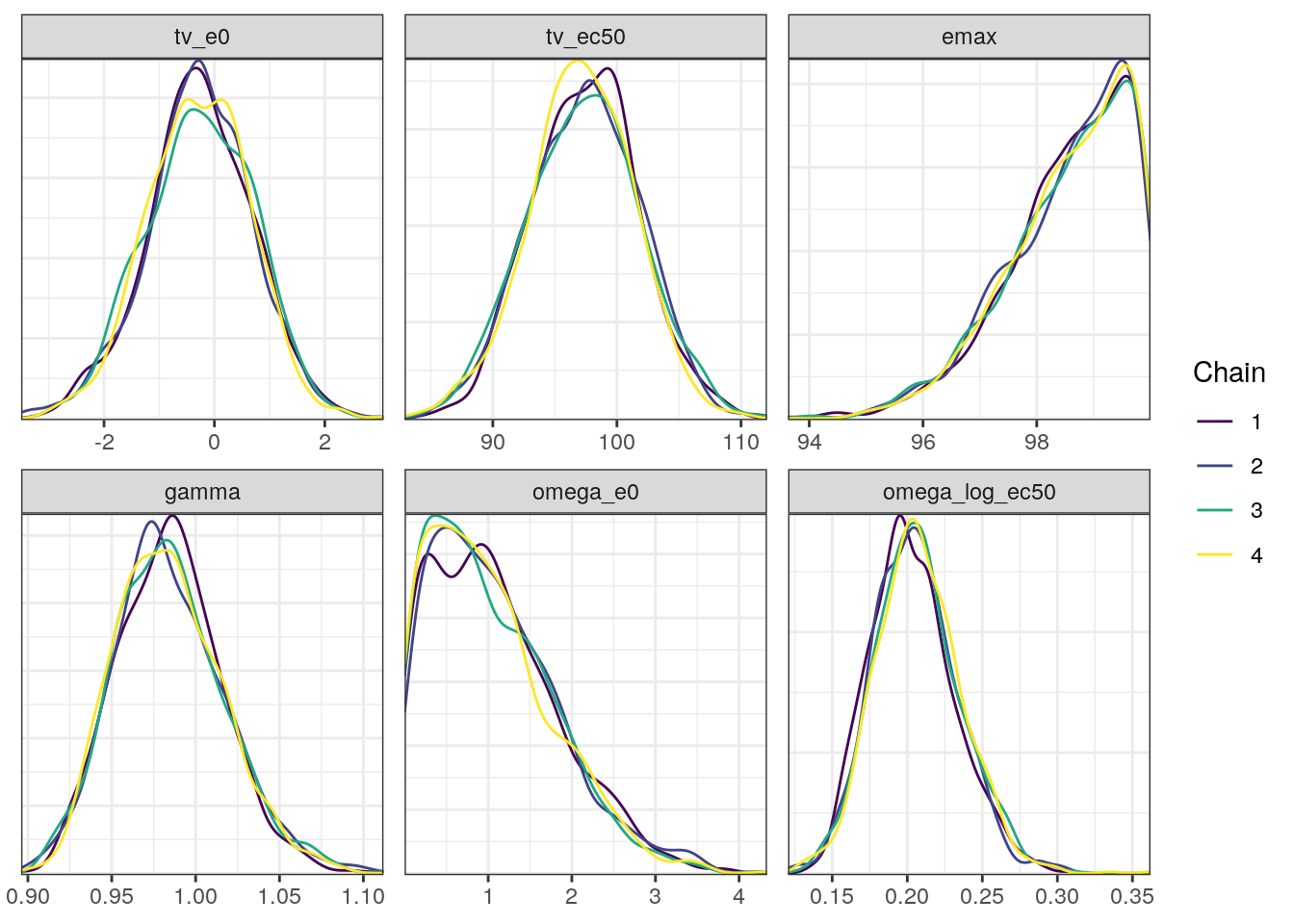
A scatterplot of the MCMC draws can be useful in showing bivariate relationships in the posterior distribution. The default scatterplot generated with mcmc_pairs uses points for the off-diagonal panels and histograms along the diagonal.
mcmc_pairs(fit0$draws(),
           pars=c('tv_e0','tv_ec50','emax','gamma',
                  'omega_e0','omega_log_ec50'))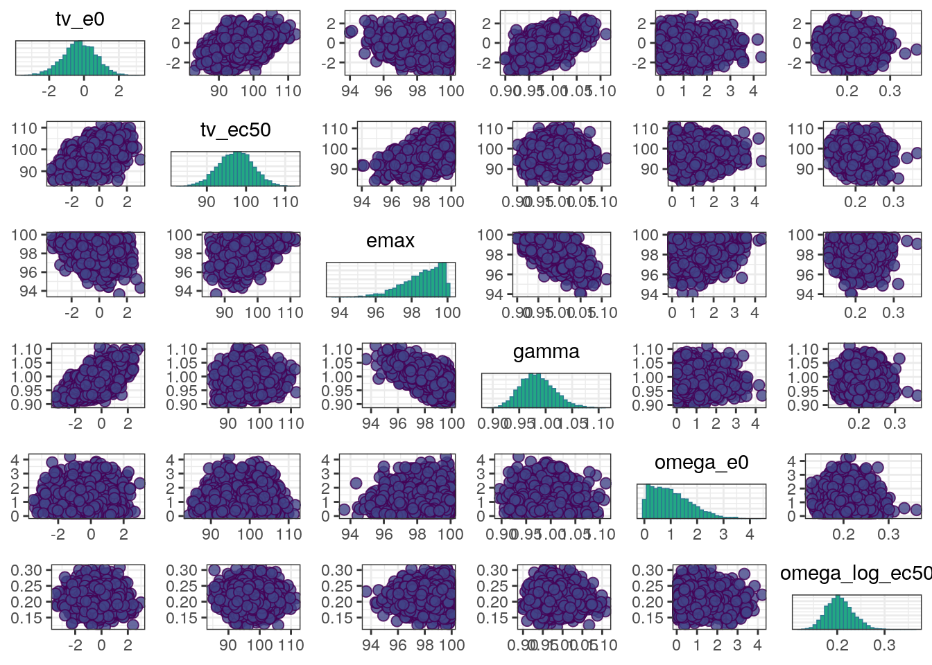
A more informative plot might use density estimates and transformations to bounded parameters. We can make these modifications using the diag_fun, off_diag_fun, and transformations arguments:
mcmc_pairs(fit0$draws(),
           pars=c('tv_e0','tv_ec50','emax',
                  'gamma', 'omega_e0','omega_log_ec50'),
           transformations = list(`tv_ec50`='log',
                                  emax=function(x) qlogis(x/100),
                                  gamma='log',
                                  `omega_e0`='log',
                                  `omega_log_ec50`='log'),
           diag_fun = 'dens',
           off_diag_fun = 'hex')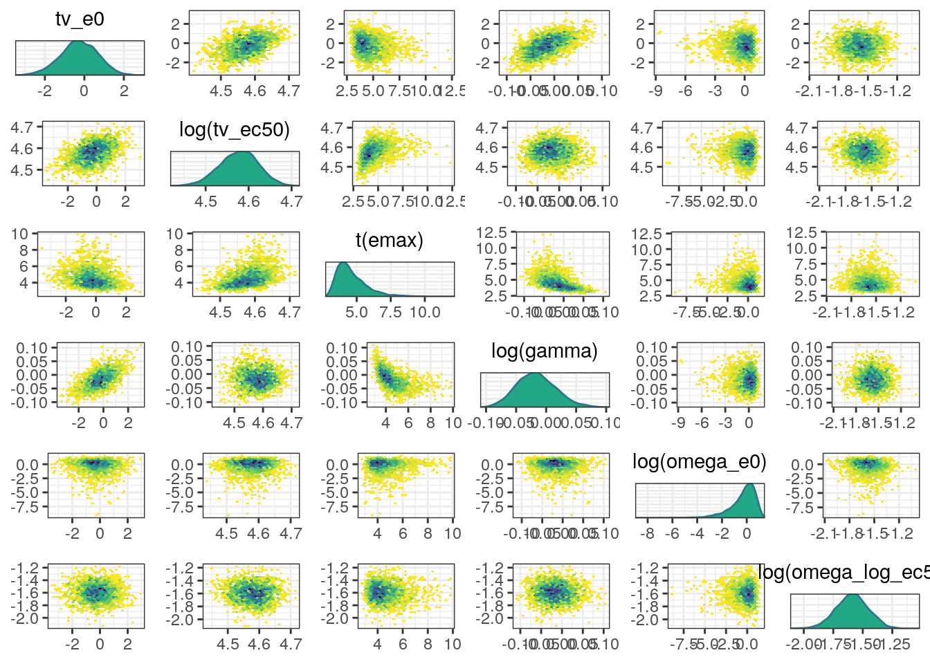
In general, the MCMC diagnostics look good with low R-hat values, high ESS values, and no red flags in the trace, density, or scatter plots.
Model evaluation - Posterior Predictive Checks
A posterior predictive check (PPC) compares summary statistics from the observed data to the posterior predictive distribution for the same statistics from the model. Recall, the generated quantities block was used to simulate data from the posterior predictive distribution:
. generated quantities {
.   vector[N] simdv_obs;
.   vector[N] simdv_new;
.
.   // Simulated observations for observed subjects
.   for (i in 1:N) {
.     simdv_obs[i] = normal_rng(mu[i],sigma);
.   }
.
.   // Simulate observations for new subject
.   {
.     vector[n_id] ec50_new;
.     vector[n_id] e0_new;
.     vector[N] mu_new;
.
.     for (i in 1:n_id) {
.         ec50_new[i] = lognormal_rng(tv_log_ec50,omega_log_ec50);
.         e0_new[i] = normal_rng(tv_e0 , omega_e0);
.     }
.
.     for (i in 1:N) {
.       mu_new[i] = e0_new[ID[i]] + (emax-e0_new[ID[i]])*pow(Conc[i]/100,gamma) /
.                             (pow(ec50_new[ID[i]]/100,gamma) + pow(Conc[i]/100,gamma));
.       simdv_new[i] = normal_rng(mu_new[i] , sigma);
.     }
.   }
.
. }
First, we’ll read the data and data specification (for help with labeling the plots).
exdata3 <- read_csv(here('data','derived','exdata3.csv'), na='.')

spec <- load_spec(here('data','derived','exdata3.yml'))

exdata3 <- ys_add_factors(exdata3, spec)

ind_exdata3 <- distinct(exdata3, ID, .keep_all = TRUE)

labs <- ys_get_short_unit(spec)
To help generate the plots in a reasonable amount of time, we’ll use a subset of 500 posterior samples. In practice, we would use all of the posterior samples.
FXa vs concentration
Our first PPC will look at the median, 5th, and 95th percentiles of the distribution of FXa inhibition as a function of drug concentration.
We’ll use the tidybayes::spread_draws function to extract and shape the posterior samples into a form that’s helpful for making the PPC plots and join the observed data primarily for the corresponding drug concentrations.
ppc <- spread_draws(fit0, simdv_obs[num], simdv_new[num],
ndraws = 500,seed = 9753)head(ppc). # A tibble: 6 × 6
. # Groups: num [1]
. num simdv_obs .chain .iteration .draw simdv_new
. <int> <dbl> <int> <int> <int> <dbl>
. 1 1 -7.70 4 878 3878 -3.64
. 2 1 -14.3 4 467 3467 8.12
. 3 1 20.4 2 363 1363 6.42
. 4 1 -23.7 4 409 3409 0.843
. 5 1 -15.5 4 802 3802 -0.453
. 6 1 -2.13 4 48 3048 14.0ppc2 <- left_join(ppc, exdata3 %>% mutate(num=1:n()))With the observed and simulated data in-hand, we can use the tidyvpc package to make the plot for us.
vpc_conc <- observed(exdata3, x=cobs, y=fxa.inh) %>%
  simulated(ppc2 %>% arrange(.draw,num), y=simdv_new) %>%
  stratify(~dose) %>%
  binning(bin='jenks', nbins=10) %>%
vpcstats()plot(vpc_conc, legend.position = 'right')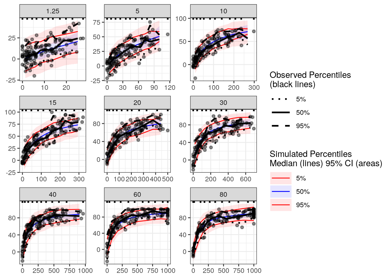
Based on this plot, the model appears to be capturing the relationship between FXa inhibition and drug concentration adequately.
FXa inhibition vs time by dose (median, 5th, 95th percentiles)
Because time was not explicitly accounted for in our model, we might also be interested in understanding whether the model adequately describes the relationship between FXa inhibition and time. We’ll look at this relationship stratified by dose because of the large differences in FXa inhibition across doses.
Because the samples were obtained at a fixed grid of times, we’ll use these nominal times as our binning variable.
vpc_time <- observed(exdata3, x=time, y=fxa.inh) %>%
  simulated(ppc2 %>% arrange(.draw,num), y=simdv_new) %>%
  stratify(~dose) %>%
  binning(bin=time) %>%
vpcstats()plot(vpc_time, legend.position='right')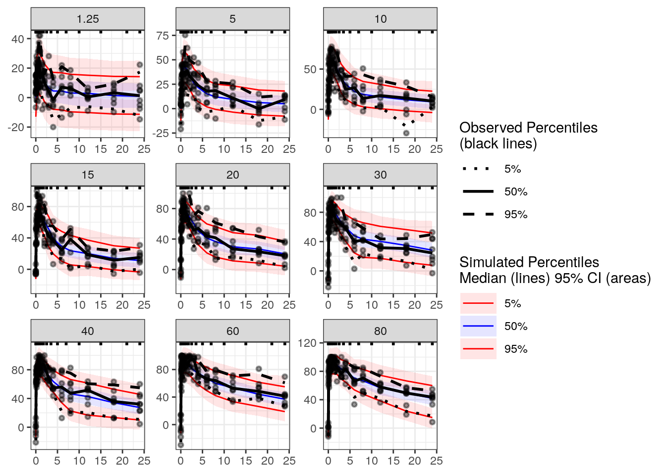
The model captures the relationship between FXa inhibition and time.
Correlation between baseline and post-baseline FXa inhibition
Lastly, we may be interested in how the model captures changes within individuals. To that end, let’s look at the observed relationship between baseline and post-baseline FXa inhibition stratified by time after dose:
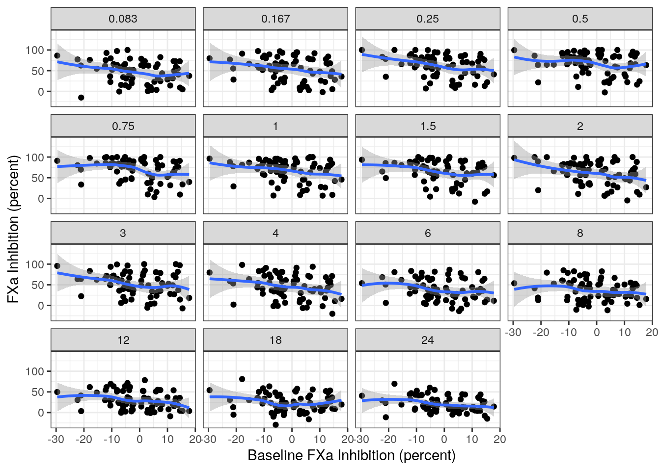
There appears to be a moderate-negative correlation across all of the time points. Let’s see whether the model is able to capture these correlations.
obs_correlations <- exdata3 %>%
  ungroup() %>%
  filter(time > 0) %>%
  left_join(exdata3 %>%
              filter(time==0) %>%
              ungroup() %>%
              select(ID, bsl=fxa.inh)) %>%
  group_by(time) %>%
  summarise(cor=cor(bsl,fxa.inh))
sim_correlations <- ppc2 %>%
ungroup() %>%
filter(time > 0) %>%
left_join(ppc2 %>%
filter(time==0) %>%
ungroup() %>%
select(.draw,ID, bsl=simdv_new)) %>%
group_by(.draw,time) %>%
summarise(cor=cor(bsl,simdv_new)) %>%
group_by(time) %>%
summarize(median=median(cor),
qlo = quantile(cor, prob=0.05),
qhi = quantile(cor, prob=0.95))sim_correlations %>%
ggplot(aes(x=factor(time), y=median)) +
geom_pointrange(aes(ymin=qlo, ymax=qhi)) +
geom_point(data=obs_correlations, aes(y=cor), col='red') +
labs(x=labs$time, y='Correlation')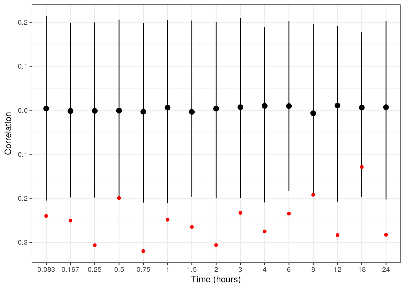
Let’s add a note describing this observation.
mod0 <- mod0 %>%
  add_notes("Model does not capture within subject relationship between baseline and post-baseline observations.")
Recall, the model assumes the individual baseline and EC50 are uncorrelated and that the residual errors are independent. Thus, it’s not surprising that the model isn’t capturing this relationship.
Other resources
The following script from the GitHub repository is discussed on this page. If you’re interested running this code, visit the About the GitHub Repo page first.
Stan Model Diagnostics script: initial-model-diagnostics.Rmd